Posted in creativity, Fiction, Graphic Novel, International, Writing

Amazing new genre pushing boundaries

As a family we’ve recently been on a graphic novels kick.

It certainly makes for shared reading, because books can be savoured and re-read within a realistic time frame.  With text intense books, what often happens is one person gets to read the book from beginning to end and then it’s due back to the library.  Or by the time the second reader is well into the book the first reader has either forgotten vital details, or even worse, blurts out bits of plot and ruins the surprise.  “The butler did it — oops, sorry!”

Despite what you might think, graphic novels can deal with tough, adult subjects.  Art Spiegelman’s Maus springs to mind.  I had read the first version when it came out ages ago, but the most recent edition has more material, and more harrowing material.

We’ve also read Guy Delisle’s Jerusalem, Chronicles from the Holy City   and his Burma Chronicles, Pyongyang (North Korea) and Shenzhen

Young Sprout of course is not ready for adult narrative but has been reading the Little Prince series.  These have a steampunk esthetic and a sophisticated narrative technique. In each story the Little Prince and Fox, his companion, land on a different planet and have to figure out how to help the inhabitants deal with their problems — leading to discussions about motivations and character and why he might like some stories more than others.

Lauren Redniss has pushed this genre to a whole new level.  Radioactive, Marie & Pierre Curie: A Tale of Love and Fallout  combines     the biography of Marie Curie with many sidebars about nuclear war, nuclear tests, nuclear energy, chemotherapy, x-rays.  The artwork is done with cyanotype  a     type of sun printing.  (<<<<  this link includes a slideshow of selected pages to get a tiny idea of the book).

Ah, what inspiration!

More to follow on the resulting output — but that’s a post for another day!

P.S.  No, it’s not lost on me that ironically, a post about graphic novels has no image.

P.P.S.  Most of the links are to Amazon.ca (Canadian website).  Readers in other countries should Google to see if Amazon has a site in their home country.

Posted in quilting

How not to Quilt # 3

And I promise, I’m not doing this deliberately!

IMG_0723This is a scrappy 9-patch inspired by Joan Ford’s Cut the Scraps! book made with many, many two-inch squares.

A  couple of firsts on this one

  1. The border is mitred, following Kimberly of the Fat Quarter Shop‘s YouTube video (although of course you can’t see any of the border on this shot)
  2. What you can see is the masking tape I used to mark the quilting lines.
  3. Planning a two-colour binding.  Matching the border on top, and matching the backing on the back, since it’s a subtle, elegant print that is completely unlike the cosy, energetic, scrappy top.

so what’s the non deliberate error, you ask?

Pulling the masking tape off after only having quilted along one side of it (middle row with the ripped piece of tape)

Fortunately I saw my error in time, and reused a strip of tape to replace the wadded up sticky ball I just removed prematurely.

More quilting has been done since this pic was taken and the quilting does look straight and the stitches are fairly even.  Of course with machine stitching you might think that would be a given, but not necessarily!

Posted in Uncategorized

Interior Design Notes

This syndicated article by Melissa Rayworth of Associated Press appeared in our local paper yesterday.

Here is what Meredith Heron has to say about natural light and colour, especially wall colour:

The natural light in a room impacts how a pastel colour actually appears, says Heron. East-facing windows bring a cool, blue light during the day, while west-facing windows bring in a redder light in the afternoon and at sunset. Heron says south-facing windows tend to offer a yellower light.

“My rule of thumb is to avoid the pastels that correspond to the direction of the light,” she says. “So no pinks in a western-facing room or they will look like something out of an antacid commercial.” Likewise, avoid pastel yellow in a south-facing room and blue in an east-facing one.***

*** My personal opinion is you cannot go wrong with blue, because it is easy to pop in some contrasting pops of warm colours such as orange, brown, tan or coral.

Notice she does not say anything about northern light, which is the best light for art studios — and something I still miss from my last apartment which had wide open northern light not overlooked or overshadowed by other buildings.

I have made many decorating faux pas over the course of a lifetime of moves.  Of course some mistakes are rooted in the time the decorating was done — like trying to coordinate pink roses on a white background with a slightly different pink with silvery white polka dots (my childhood room in the 50s before designers were offering really coordinated collections — I was just ahead of my time!), or setting a trend for orange drapes in the 70s.  We lived in a downtown neighborhood where all the homes were right at the street so you could not help but notice what drapes everyone had.  At first people thought ours were weird but within a few months everyone else had orange drapes too!

Posted in quilting

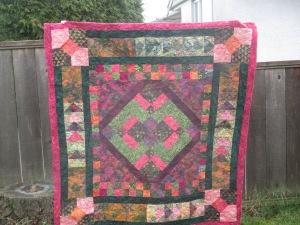
Batik Mystery Quilt Finished!

front  IMG_0637I started this quilt an embarrassingly long time ago at a Guild mystery quilt workshop led by Arlene MacKenzie and Kelly English.  We were to bring a bunch of coordinating fat quarters plus one metre of another fabric.   I had enough batiks on hand that all I had to do was buy a metre of the dark green inner border and set aside a pile of other batik (mostly yardage).

Biggest challenge before the workshop?  Not cutting into the dark green for other projects.

The great thing about an Arlene and Kelly workshop is that they really give individual attention.  Even before we made the disappearing 9-patch in the centre medallion, Kelly was going round the tables, asking each of us  which of our fabrics we really wanted to show off and advising which ones to set aside for later blocks where larger pieces would be needed.

So everyone got to make a unique quilt, (except one enthusiastic over-achiever who went home and started a second mystery quilt using different fabrics in the week between the two classes)  and I don’t think anyone was left with the feeling they would have made vastly different design decisions than they did.

So, what do you think?  Have you done a mystery quilt and were you happy with it?  Would you do it again?

FABRIC NOTES:

We are so blessed that Bib N’Tucker has the biggest batik selection in western Canada — and is poised to open in more spacious premises very soon.

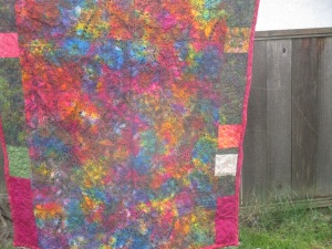
The back is home to fabric that’s just too gorgeous to ever think of cutting, with a few batik leftovers making up the difference. IMG_0638This is a hand-dyed print from Africa which I bought from Pippa Moore of  Kitambaa

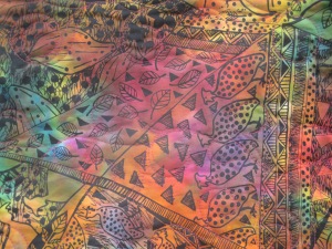
detail of the back

IMG_0639shows the African design with Zentangle-esque pattern elements, which has been overdyed with a low-immersion technique.  and showing Arlene’s beautiful long-arm quilting too.  This was too gorgeous to attempt to do on my home sewing machine.

Posted in quilting

How not to Quilt # 2

IMG_0665

The moment three-quarters of the way through quilting the improv dragonfly started in Katie Pedersen’s workshop when I realized that the white on white fabric I was “using up” as backing was sandwiched printed side in …

IMG_0666

Here you can see how the back of this piece will look (the flipped over triangle at the bottom of the photo).

Well, at least it’s not an alphabet print, so let’s not tell anyone, shall we?

I have extensive stash of white on white, cream on cream, off white on off white prints.  Great for overdyeing either on their own or as part of a finished quilt, as Ana Buzzalino does, not so great when trying to make more modern-looking quilts.  But also good for backing.

Does anyone else have this problem of old-fashi?  What do you do?

Posted in creativity, modern quilting, quilting

Batik Slab Tote Finished!

IMG_0635

Leading up to the big reveal of the quilt that goes inside this …

I put this together with leftovers from the quilt itself plus some other batiks and hand dyes.  It’s a little smaller than a pillowcase and plenty big enough to take a large nap quilt with room for a book or other small items that might be needed.

Now I realize I should have taken a photo of the other side too, oh well.  I constructed this by sewing the slab into a long rectangle, folding it in half and sewing up the two side seams.  The lizard tote was folded the other way and I had to sew across the bottom and up one side seam.  Because this will be a functioning tote as the quilt will be carried around, I took care to keep the lighter colours at the top of the bag as the darker colours can withstand being set down better.

The whole tote and the handles are stuffed with batting and quilted with trilobal variegated thread which has a beautiful sheen.

Hmm, I could see getting into more totes and the like, there’s something very satisfying about functional objects that you make yourself!  I’m still going to do art pieces but sometimes the gap between the inner vision and the ultimate object is so vast.

Posted in quilting

Book Bag Finished!

Before making a tote bag for a quilt, I thought practicing would be a good idea.

We all have particular mental blocks and challenges and I can easily get myself confused when it comes to sewing things properly.  I know I could easily sew something inside out with twisted handles, or somehow have the handles stuck inside the body of the bag.  And once confused it can be hard to get back on track.

IMG_0626IMG_0627Since this was to be for the use of younger people, I searched my stash for something with kid appeal that wasn’t too girly or babyish and that would not show every mark.  This fabric seemed to fit the bill and also the critters aren’t directional.

This bag has just one side seam, which means a directional fabric would actually have been okay.  The side seam in fact makes this a nice bag for books, it’s that bit easier to slide them in and out.  And the striped lining is cool.

All in all I’m quite pleased with this, even the handles are lined with batting and quilted.

It’s functional so in my book although the fabric is traditional, it’s modern because of the emphasis on “get ‘er done!” and “make something useful!”

Posted in Art, creativity, quilting

Call for Entries – Digital Alchemy – Juried Exhibition @ International Quilt Market Houston

canvas
My Warhol hot lichen, on sale at Spoonflower, where I go by wordnerd411

Jane Dunnewold is the creative force behind this first ever exploration of how quilters are using digitally printed fabrics from print on demand companies such as Spoonflower.  Of course Spoonflower is the leading company in this groundbreaking field, and they are co-sponsoring the exhibition.  It will premiere at the 2015 International Quilt Market and Festival in Houston this fall.

Jane has put a link to the pdf of the call for entry here.

Details of size, etc. are all on the pdf.  Worth calling out:

Quilts must be made from at least 50% digitally printed fabric.  It is not a requirement that fabric be designed by the quiltmaker, but the designer must be credited.

The other pertinent rule is no online/social media sharing of work in progress until acceptance and rejection notices have been delivered.

Submissions open March 1 to April 5.

Spoonflower turns orders around fast so even if there’s nothing lurking in your stash of too beautiful to cut, you’ve got time to design and order your own fabric — trust me on this, it’s not hard — or just go shopping for other designers’ fabrics.

Since this is for a quilt show (as opposed to bed quilts) you don’t have to confine yourself to cotton.  Spoonflower can print designs onto silk, jersey and now even Minky (think pushing the envelope with soft fuzzy baby blankets in non traditional colours and designs).  Of course quilts have to be quilted and quilting on Minky might be a bit challenging, but interesting.

Posted in quilting

How not to Quilt # 1

IMG_0609The pen on the top is a Frixion.

The other pen is a regular ballpoint  I enjoy writing with because the ink is the same luscious turquoise as the pen barrel, and the same colour as the Frixion ink.

Marks on fabric or paper made by the Frixion can be erased with heat, either by pressing or using the eraser on the end of the pen (which apparently works because of the heat it generates when you rub it on paper).

As you can see, I was making binding and thought I was using the Frixion pen to draw the stitching lines.

Mistakes: Opportunities:

  1. Sewing  the wrong side to the right side instead of right sides together
  2. Not having locked my beloved turquoise ballpoint away before starting to sew

Oh well, at least it’s binding so I can make sure the ballpoint goes on the inside.   I have pinned a scrap of bright fabric by the line so I can be certain of doing that.

By the way, although Frixion pens are handy things to have around, the lines can reappear if the fabric is exposed to freezing temperatures, although they fade once the fabric is at normal temperature.

Posted in creativity, Fiction

Sock Creature Dramatic Reveal!

mug run laura004The story so far:

Snarfie and Pie Thagoras have spent the previous 350 pages having various suspenseful gothic adventures largely stemming from their need to save their ancestral home from being redeveloped into a bingo hall.

Reluctantly they agree to sell the family portraits.  With heavy hearts and grubby feelers they repair to the Long Gallery and begin boxing up portraits by Van Dyk, Reynolds, and Gainsborough, ready for the monsters from Christie’s to sell them at auction.

They work their way from Elizabethan times up to the early 20th century and lift down the portrait of their great-grandparents, painted by a friend of Picasso’s.  Turning over the precious artefact, what do they find but the long lost legendary Ginormous Emerald either won by Sir Jonas Sock-Creature, the 18th-century buccaneer in a game of chess with an exotic oriental despot (the family story) or perhaps “liberated” when Sir Jonas helped himself to it while a guest of the Maharajah.

MUG RUN LAURA005_cropSir Jonas Sock-Creature, illustrious 18th-century buccaneer.

Sir Jonas bravely fought with hippos and crocs on his adventures!

The family fortunes are restored in the nick of time and the cousins celebrate by snarfing coconut cream pie in the Great Hall.